R.K. Joshi : The man with the brush
- Jan 21, 2014
- 4 min read
A Calligram of Lord Ganesha withbeeja-akshra 'Gan'

As mentioned earlier, India is one of the four countries to have formulated and adopted a national design policy. Design education has been a spirit of growth in the last 5 years or so. What we have to focus on is the empowerment or encouragement of good design in this country that basis itself from the core of Indian culture and needs and makes it a strength to stand out, to progress and sit a platform in the international market. To highlight the designers and their contributions to the indian design world would be an act of respect (a tribute to the designers) and of awareness (for people to understand the value of Indian culture and design).
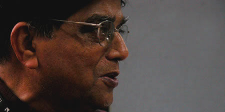
As a tribute, the best pioneers in Indian design were chosen, starting with the great calligrapher and designer R.K.Joshi. Professor R K Joshi Designer, Artist, Teacher, Calligrapher and Poet passionately contributed a life time of work towards Indian typography and type design. He was one of the rare contemporary designers deeply rooted in culture and tradition. He was involved in multi-lingual communication activities as part of the Indian advertising industry for almost 30 years. As faculty at the Industrial Design Centre, IIT Bombay, he initiated academic and research projects in promoting Indian languages and scripts in the field of design and computer technology. He influenced a whole generation of students on typography and type design. Some of these students went on to design typefaces in many of the Indian languages. One of the most memorable academic events at IDC, 'Akshrayaoga' in 1986, was held under his co-ordination. He had also co-ordinated an international exposition on Calligraphy, 'Akara', in N Delhi in 1988. Students remember him for being a highly motivating force in typograhy and Indian type design. As a Visiting Type Design Specialist at the National Centre for Software Technology (NCST) he contributed in the area of language technology and type design.
Fascinated by signboards from childhood, he wondered how one can make such boards in beautiful type. He appreciated the beauty of type and it's structures, as mentioned in one of his interviews, how he admired one of his school teachers hand-writing. After joing J.J. school of art, he endevoured to do all ssignments in Indian languages, beacause of his love for the language. He wondered why there were no Indian language typefaces as part of the course. He learnt about the issues in Indian typefaces, and relised that therefore all type was in Latin style. Exposed to calligraphy, he decided to explore it in the indian context. The need for Indian typographers in an age devoid of such, made him become one in 1966. He quotes how 'the typefaces we develope should have a calligraphic mind behind them to understand form and how it evolves.
First campaign for farmers and housevivwes in 1962, marked a statemnet in the design world, as RK Joshi implemented the campaign in devnagiri, all signle-handedly. The reason for choosing devnagirir was because their was a lcak of understanding of English among the farmers and housewives.
He famously quotes 'jo apna hai, voh apnana hai' (what is ours, has to be embraced). He believes that the Indian designer has not captured 'this' India. ' We can design beautiful chairs, layouts in Latin script or other languages, but we have to realize that India, take it in and express it through our works and contribute to the profession in a small way. '
Design should be inculcated from the grassroot levels, from the fundamental beginning, he says. And why not, design after all is not a course or a field, it is a way of thing, it is a behaviour we initiate in our children.
"Technology is great, it helps and we should salute the people who invented it, but at the same time, we must also salute the guy who first drew the line on land."

A Calligram of Lord Ganesha withbeeja-akshra 'Gan'

A Calligram of Lord Ganesha withbeeja-akshra 'Gan'

A Calligram of Lord Ganesha withbeeja-akshra 'Gan'

A Calligram of Lord Ganesha withbeeja-akshra 'Gan

A Calligram of Lord Ganesha withbeeja-akshra 'Gan

A Calligram of Lord Ganesha withbeeja-akshra 'Gan

A Calligram of Lord Ganesha withbeeja-akshra 'Gan

A Calligram of Lord Ganesha withbeeja-akshra 'Gan

'Aum'- a calligraphic interpretation of 'Nada' vibrations emerging from 'Aum'- through the permutations and combinations of the letters A,U, & M in Devanagari

12 Couplets from 'Meghadoot'- the epic poem by Kalidasain Sanskrit

A Calligram of Ganesha with beeja-akshara 'Gan"

Steel Authority of inida PVT LTD (1973)

The simple rhombic shape showcasing CEAT was designed in 1983 by Late Prof. RK Joshi. The erstwhile form signified performance, style, strength and durability of CEAT Tyres. The tag line Born Tough extended the significance of the logo further. The two triangles bracketing the word CEAT marks its exclusivity among tyre brands of early 80s when CEAT emerged as one of its first kind. The simple bold letters of CEAT establish a premium position of the products in the market then. CEAT now has a new logo having bold, more geometric characters with simplified lines showing changing perception of speed and mobility of tyres in present era.

India Post : The corporate logo of India Post was first launched on India Post Day, 9th Octuber 1993. It represented speedy action and dynamism. The logo also shows the skill and good sense of aesthetics in form of an appealing asymmetric balance in the form. The form is an envelope, the straight parallel lines with sharp angular ends represent the speed with which the postal India services transfers posts across the length and breadth of India. The colour Red signifies the depth of its reach in India. Red adds extra prominence to the speed concept of postal services for which the logo stands for.

Comments